Paulus Posted July 20, 2015 Posted July 20, 2015 (edited) Very often we are basing our decisions on images of coins. I would like this topic to centre around how we present our coins, and what to look out for imagery-wise.I'll kick off with a question, what grade would you assign to these coins based on the pics alone? Edited July 20, 2015 by Paulus 1 Quote
Nicholas Posted July 20, 2015 Posted July 20, 2015 (edited) Both EF? Can't zoom in though so not sure. James shilling looks lovely - v. neatly struck. Some random thoughts on coin images: 0. I would like to see the 3rd side of each coin- the rim (no one does this yet..). I would also like a side-on view to see how flat the coin is - does it have and bends or waviness..1. Photos on any digital device enhance the coin's image because they glow from the electronically enhanced digital pixels. Really nothing like the coin in hand and generally much more exciting than in real life. I guess though it helps us all equally. 2. As each auction house has different image styles and definition detail, I sometimes consider this as a factor in which house to choose. Whether you believe this or not... 3. I have seen the same coin look completely different in 2 auction house catalogues that I know affected the final hammer price. Eg 1. CNG makes coins look better by stretching them laterally and wash out colour variances on silver coins and make gold coins look great!Eg 2. Spink have this strange false definition now made to their images - not very naturalEg 3. Baldwins just never give away too much by keeping the image pixels low - think soft focusEg 4. Heritage have brutally strong close ups - can be dangerous especially on hammered coins. .. I could go on but I think I'm off thread already! Edited July 20, 2015 by Nicholas 2 Quote
hazelman Posted July 20, 2015 Posted July 20, 2015 This is an area that i have as yet failed. My pictures at their best can be described as adequate.I will be spending time learning to improve this particular skill. But everything with time. Having shared on this site i believe that my failings have been due to:1. Not taking pictures in day light2. Using a Microscope or scanJudging from the info many have shared i believe the way forward for me is to get a macro lens for camera, with a small tripod. And then to alwaystake my pics in broad daylight.Having said that i am always willing to learn what and how others achieve such great pics.Nicholas is clearly a man with great skills and vision (perhaps i also need to visit spec savers)Someone said i should put a magnifying glass above the coin and use my iphone - not sure of the result havent tried this yet.On the coins i would agree EF for the hammered and perhaps a slightly more generous Aunc for the 1899, but would specify that it has a scratch above Queens head.Hoping there is a lot more discussion around this topic. 1 Quote
Nordle11 Posted July 20, 2015 Posted July 20, 2015 I always enjoy looking at brg5658's photos of his conders.. They always look great, especially with the section at the bottom. (example attached)The daylight here is too bright for coin pictures, it almost dampens the lustre, so I prefer the artificial light. Normally the sunlight is the best though, or a combination of the two.Nice, big, squared off pictures like your first, Paulus, are great. When I'm buying a coin, that's the sort of thing I want to see.. Quote
Cliff Posted July 20, 2015 Posted July 20, 2015 I too hope this topic expands. Any pics I take are completely 'hit or miss' (more miss than hits!) and I would appreciate any help that anyone may wish to offer. My 'full view' pics especially often don't do do my coins the justice they deserve. Quote
PWA 1967 Posted July 20, 2015 Posted July 20, 2015 I always enjoy looking at brg5658's photos of his conders.. They always look great, especially with the section at the bottom. (example attached)The daylight here is too bright for coin pictures, it almost dampens the lustre, so I prefer the artificial light. Normally the sunlight is the best though, or a combination of the two.Nice, big, squared off pictures like your first, Paulus, are great. When I'm buying a coin, that's the sort of thing I want to see..Yes brg pictures are quality and always look spot on. Quote
rpeddie Posted July 20, 2015 Posted July 20, 2015 Both EF? Can't zoom in though so not sure. James shilling looks lovely - v. neatly struck.Some random thoughts on coin images:0. I would like to see the 3rd side of each coin- the rim (no one does this yet..). I would also like a side-on view to see how flat the coin is - does it have and bends or waviness.. Still a way to go with this but been working with a '35 crown using putty/power rangers play doh would have worked better if i would have been able to get the whole circumference in one picture rather than having to crop 3 together.as i said though work in progress Quote
rpeddie Posted July 20, 2015 Posted July 20, 2015 would need to click on the last image to enlarge it in case it causes confusion as an addition this image is what gave me the idea 1 Quote
Nordle11 Posted July 20, 2015 Posted July 20, 2015 That's a brilliant idea to have it 'rolled out' like that. It's like a reverse panoramic of the edge haha Quote
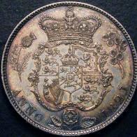
azda Posted July 21, 2015 Posted July 21, 2015 (edited) The shilling Paul is showing was one of mine. I Sent images of this to Baldwins as i was thinking of consigning it to one of their auctions and the guy there basically said "don't bother, its not good enough" his grade was GF/NVFI thought it was better than that, my pics of the coin is attached Edited July 21, 2015 by azda Quote
TomGoodheart Posted July 21, 2015 Posted July 21, 2015 (edited) I admit to varying success. However using a fairly basic point-and-shoot camera (though it does have a macro setting which I use) in bright (artificial or daylight - I adjust the colour balance with a basic photo editor afterwards to make it look (on my laptop at least) as close to 'real life as I can achieve) and holding the coin in my hand so I can tip/tilt it to best advantage seems to work fairly well.. That said, I've had less pleasing (to me) success with shiny modern coins. Though that could just be that my coin isn't as high grade as I had hoped! As for the original question, I don't have the experience to grade your coins Paul. But your pics always look a tad blue to me. For example, Dave's pic of the shilling has more of a mauveish tone, making me wonder if the background cloth in your pictures is really white? Not that makes a difference to grading. But the colour cast suggests a yellowish artificial light source might have been used and 'in the hand' the coins might look rather different? . Edited July 21, 2015 by TomGoodheart Quote
Paulus Posted July 30, 2015 Author Posted July 30, 2015 This is what I would aspire to, tips welcome BRG Quote
Nordle11 Posted July 30, 2015 Posted July 30, 2015 This is what I would aspire to, tips welcome BRG Told you BRG's were the best I think the actual detail and craftsmanship on some of the designs of the conders is amazing and certainly adds to the overall look of the pictures, but still, the pictures themselves are really professional. 1 Quote
Paulus Posted September 5, 2015 Author Posted September 5, 2015 (edited) Still battling away, and still strugglingAnyway, I am hoping some improvement is noticed, including the lack of a blue hue.Still want to employ BRG or a professional photographer!Anyway, here's my hopefully better pic of one of the coins in the OP Edited September 5, 2015 by Paulus Quote
Coinery Posted September 5, 2015 Posted September 5, 2015 I think you are just stripping out the colour to get rid of the blue, as your pictures now look nearly black and white.Definitely getting better though! Quote
azda Posted September 5, 2015 Posted September 5, 2015 Here you go Paul, use the one I took of it. Quote
rpeddie Posted September 5, 2015 Posted September 5, 2015 i think i struggle from the same thing you are struggling with, my problem is i cant seem to get gold coins to show their actual colour in pictures they always seem to come out more silver/white than they actually are, maybe a lighting issue, where instead of too little light maybe too much light? DNW pic Spink Pic my picAll pics not too great but its alot more 22ct goldy looking in reality Quote
azda Posted September 5, 2015 Posted September 5, 2015 (edited) Yours is definately lighting rpeddie. Try going outside and use the natural daylight, without flash and high marco settings Edited September 5, 2015 by azda Quote
Paulus Posted September 8, 2015 Author Posted September 8, 2015 Let's try a different coin. These are 2 pics of the same coin, taken with the same camera, which pic would make the coin appeal to you most? Quote
Coinery Posted September 8, 2015 Posted September 8, 2015 The right, obviously, as you get a better sense of the depth of field/grade. Quote
jelida Posted September 8, 2015 Posted September 8, 2015 And yet I would say that the pic on the left is the more 'correct', though I would lighten it a touch; it has a more even balance, without the glare and 'white out' of some of the highlights of the pic on the right. It is the left pic that would be chosen for a catalogue. Jerry Quote
MRD Posted September 8, 2015 Posted September 8, 2015 I would change the background as well. Not sure about the white glove!! Quote
azda Posted September 8, 2015 Posted September 8, 2015 If you want to use a white background then use a whiite A4 piece of paper instead of the glove Quote
PWA 1967 Posted September 8, 2015 Posted September 8, 2015 Looking at other pictures the ones i like in silver always appear to look better on a black background.The bronze/copper look better on white IMO.Only a thought but maybe worth trying both. Quote
Recommended Posts
Join the conversation
You can post now and register later. If you have an account, sign in now to post with your account.