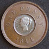
Accumulator Posted February 24, 2011 Posted February 24, 2011 Continuing to go through my coins...I have an 1896 penny which clearly has much bolder T.B. initials. In particular the full stops are almost as big as the stops between IND & IMP. It's a very noticeable difference and can easily be seen with the naked eye. Has anyone come across this?Below is a scan showing a typical Obverse 1 with the usual tiny lettering and stops. Underneath is the coin with bolder lettering. Quote
azda Posted February 25, 2011 Posted February 25, 2011 (edited) Continuing to go through my coins...I have an 1896 penny which clearly has much bolder T.B. initials. In particular the full stops are almost as big as the stops between IND & IMP. It's a very noticeable difference and can easily be seen with the naked eye. Has anyone come across this?Below is a scan showing a typical Obverse 1 with the usual tiny lettering and stops. Underneath is the coin with bolder lettering.Well now thats strange, i just took a wee looksy at mine and it doesn't have any designer name there at all Edited February 25, 2011 by azda Quote
scott Posted February 25, 2011 Posted February 25, 2011 it is there but faint, this happens all the way through the series though Quote
azda Posted February 25, 2011 Posted February 25, 2011 (edited) 2 blobs Edited February 25, 2011 by azda Quote
Rob Posted February 25, 2011 Posted February 25, 2011 Weaker strike I guess.I'd go for lower relief which would be easier to block up such that clarity is reduced. Fill a 1mm deep hole to a depth of 0.1mm and you probably won't notice; fill a 0.15mm or 0.1mm deep hole to the same depth and any design will almost or completely disappear. Quote
Gary Posted February 25, 2011 Posted February 25, 2011 Weaker strike I guess.I'd go for lower relief which would be easier to block up such that clarity is reduced. Fill a 1mm deep hole to a depth of 0.1mm and you probably won't notice; fill a 0.15mm or 0.1mm deep hole to the same depth and any design will almost or completely disappear.What Rob said. If you look at the darker coin you will see that the legend is also bolder and stands out more, probably an early strike. I have checked mine and they are both different. One has a worn T and a missing first full stop and the other one is as your bright 96. Quote
Peckris Posted February 25, 2011 Posted February 25, 2011 Looking at your "bolder" example, all the legend shows signs of a double bounce (everything's a bit doubled), which would be enough to blur such tiny letters (and the initials TB are well blurred along with the larger dots). That's what I think may have happened. Quote
1949threepence Posted February 26, 2011 Posted February 26, 2011 I've checked my old head Viccies, all of which are UNC, and I can see the initials on all of them, although they are faint, and (if I didn't know) I wouldn't be able to make out what they said without the aid of a magnifying glass. Quote
Recommended Posts
Join the conversation
You can post now and register later. If you have an account, sign in now to post with your account.