Coinery Posted May 9, 2012 Posted May 9, 2012 I'm sorry to keep dragging you all into this, but I'm just about to make a massive investment in time creating the following tile cut-outs, so would really appreciate absolutely any thoughts on presentation.As you all know, I would like to present all the busts and distinguishing features of the Elizabeth I silver series in an eye-pleasing photographic form, and maybe put it on the web as a reference for easier identification of the hundreds of different varieties of Elizabethan coins.I played with the below a little while ago, and felt I may have made it too pretty, I'm wondering if I should make it look a little more 'old,' medieval perhaps? Honestly, negative thoughts, constructive critisism, ANYTHING, please bring it on...how would you like to browse a webpage for something LIKE this? It could be Victorian overdates, anything really! Quote
Debbie Posted May 9, 2012 Posted May 9, 2012 Mmmm I'm not sure that the label looks right in that shape or colour to be honest - perhaps a yellow would work better, and it needs to be nearer to the top of the image away from the coins a little more. I also think perhaps the larger imaage could work better on the eye if its the actual coin and the rose slightly smaller? After all even if its the same size as the coin it will still be more magnified. Sorry you did ask! Quote
TomGoodheart Posted May 9, 2012 Posted May 9, 2012 I'm sorry to keep dragging you all into this, but I'm just about to make a massive investment in time creating the following tile cut-outs, so would really appreciate absolutely any thoughts on presentation.As you all know, I would like to present all the busts and distinguishing features of the Elizabeth I silver series in an eye-pleasing photographic form, and maybe put it on the web as a reference for easier identification of the hundreds of different varieties of Elizabethan coins.I played with the below a little while ago, and felt I may have made it too pretty, I'm wondering if I should make it look a little more 'old,' medieval perhaps? Honestly, negative thoughts, constructive critisism, ANYTHING, please bring it on...how would you like to browse a webpage for something LIKE this? It could be Victorian overdates, anything really!Cool, but I think ovelapping the images confuses things a bit. I think the James I shilling you have on ebay (is that you?) makes a good striking image to start a section, but when discussing the marks themselves, I'd rather have them apart, though I like the idea of having the coin the image comes from there too. And the 'plaque' with text doesn't do it for me. I think I'd stick to text alone .. and not italics. That way the text more closely resembles the legend lettering. But I wouldn't worry too much about that aspect. Stick to one font, similar to the one you have. Quote
Coinery Posted May 9, 2012 Author Posted May 9, 2012 Mmmm I'm not sure that the label looks right in that shape or colour to be honest - perhaps a yellow would work better, and it needs to be nearer to the top of the image away from the coins a little more. I also think perhaps the larger imaage could work better on the eye if its the actual coin and the rose slightly smaller? After all even if its the same size as the coin it will still be more magnified. Sorry you did ask! Just the kind of feedback I'm after, Debbie! The more I look at it, the more I see 'wedding invite'! Quote
Coinery Posted May 9, 2012 Author Posted May 9, 2012 I'm sorry to keep dragging you all into this, but I'm just about to make a massive investment in time creating the following tile cut-outs, so would really appreciate absolutely any thoughts on presentation.As you all know, I would like to present all the busts and distinguishing features of the Elizabeth I silver series in an eye-pleasing photographic form, and maybe put it on the web as a reference for easier identification of the hundreds of different varieties of Elizabethan coins.I played with the below a little while ago, and felt I may have made it too pretty, I'm wondering if I should make it look a little more 'old,' medieval perhaps? Honestly, negative thoughts, constructive critisism, ANYTHING, please bring it on...how would you like to browse a webpage for something LIKE this? It could be Victorian overdates, anything really!Cool, but I think ovelapping the images confuses things a bit. I think the James I shilling you have on ebay (is that you?) makes a good striking image to start a section, but when discussing the marks themselves, I'd rather have them apart, though I like the idea of having the coin the image comes from there too. And the 'plaque' with text doesn't do it for me. I think I'd stick to text alone .. and not italics. That way the text more closely resembles the legend lettering. But I wouldn't worry too much about that aspect. Stick to one font, similar to the one you have.Brilliant feedback, I definitely need to make it look a little more academic, far too frilly! Weird how you can get sidetracked by software, I'm surprised now that I didn't put a bow on it.I think the second image gives context, but maybe make it more transparent.Keep it coming please, I'll put up some different variants as soon as... Quote
seuk Posted May 9, 2012 Posted May 9, 2012 As you may have seen I'm doing a similar study on the counterfeit George III silver coins.I feel its easier on the eye to have a neutral background. Also I prefer not to cut the details out as there's a risk of removing part of the design. Quote
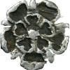
azda Posted May 9, 2012 Posted May 9, 2012 Liking it to be honest, but take the rose off the coin so er can See the coin in its entirity. Quote
Colin G. Posted May 9, 2012 Posted May 9, 2012 My advice would be to choose something that is easy to update/replace, it is amazing how these things snowball once they get going, and you start getting image updates. I have learnt it is important to make it as time efficient as possible....if you want a social life!! Quote
Coinery Posted May 9, 2012 Author Posted May 9, 2012 As you may have seen I'm doing a similar study on the counterfeit George III silver coins.I feel its easier on the eye to have a neutral background. Also I prefer not to cut the details out as there's a risk of removing part of the design.Wow, that site of your's is developing fast; amazing resource, and something to aspire to!The only thing I'd say is the BCW line drawings are presently the major resource for all the variations, and I thought a cut-out photograph to be far more representative, and much simpler for identification purposes, without losing valuable information. The BCW book ignores legend variations, other than to state the numerical composition of the letters (FR/FRA 2/3 etc) and their placements before or after the leaves. There really are many hundreds of variations, but most types being able to be identified by pretty much anyone armed with a pictures of the rose, lions, LIS, shield, leaves, and bust...that pretty much does it! We wouldn't 't be dealing with anything like the details you're looking at...no serifs, letters, flaws, scratches, etc. just a simple collection of just:The busts19 roses69 LIS97 'cats'28 leaves63 shieldsAND 2 sceptres Just these few 'course' identifiers are all that's required to pinpoint any one of around 1050 different recorded die-pairings, so I thought it would be possible to replicate the line drawings in photos?And 'neutral' background, I think you're right there too (maybe simpler, at least)!Thanks, Seuk! Quote
Coinery Posted May 9, 2012 Author Posted May 9, 2012 Liking it to be honest, but take the rose off the coin so er can See the coin in its entirity.:-) the background coin was meant to be the 'arty' bit, it was only to give a bit of context to the rose, it's totally uneccesary really! That particular rose is present on lots of other very different varieties!I think i've definitely got carried away with a new piece of software:-) If you know anyone who wants a coin-themed wedding, I could always do the invites???? :-) Thanks Azda, will keep adding compositions, hoping to get it right! Keep the comments coming for me, I'd really appreciate it! Quote
Coinery Posted May 9, 2012 Author Posted May 9, 2012 My advice would be to choose something that is easy to update/replace, it is amazing how these things snowball once they get going, and you start getting image updates. I have learnt it is important to make it as time efficient as possible....if you want a social life!! Thanks Colin, good filing is a must, that's for certain! I have learnt that even today, with a 6-part picture! Disciplined disciplined, disciplined...then wine! ;-) many thanks! Quote
Coinery Posted May 10, 2012 Author Posted May 10, 2012 Any more thoughts, particularly background prissyness, does is need to be solid colour? Times New Roman, does that give a more academic feel? I'm thinking of having these as little click-on tiles on their own page of roses (19 rose punches in all), good plan? Quote
choolie Posted May 10, 2012 Posted May 10, 2012 That is nice but the background colour is a bit wishy washy, a solid deep blue or red might work better in my opinion. Quote
Gary D Posted May 10, 2012 Posted May 10, 2012 That is nice but the background colour is a bit wishy washy, a solid deep blue or red might work better in my opinion.New Times Roman is not considered cool now days. Try an Arial or something more modern. Quote
Coinery Posted May 10, 2012 Author Posted May 10, 2012 That is nice but the background colour is a bit wishy washy, a solid deep blue or red might work better in my opinion.Thanks for your input, choolie, I'll give it a try! Quote
Coinery Posted May 10, 2012 Author Posted May 10, 2012 That is nice but the background colour is a bit wishy washy, a solid deep blue or red might work better in my opinion.Thanks Gary D, will see what I've got with the software, everyone's feedback is really appreciated!New Times Roman is not considered cool now days. Try an Arial or something more modern. Quote
Coinery Posted May 10, 2012 Author Posted May 10, 2012 Ok, solid background (choolie) and a more modern font (Gary), any final thoughts? Also a green graduated background and that's it, I'll just get on and do it then!So, any thoughts overall? Quote
ski Posted May 10, 2012 Posted May 10, 2012 i like the graduated background, would have loved to have seen it in blue.text font/s ize / location i like.i do feel the rose is too much in your face, im wondering if it was scaled down a little, maybe it would be less so and not lose any detail.nice. Quote
Coinery Posted May 10, 2012 Author Posted May 10, 2012 And my own favourite to date!And THAT'S IT! Quote
Debbie Posted May 10, 2012 Posted May 10, 2012 Sorry Coinery but I like the green better.... I think its also because the background at the top is lighter so the shape of the label isn't so contrasting.... Quote
Coinery Posted May 10, 2012 Author Posted May 10, 2012 i like the graduated background, would have loved to have seen it in blue.text font/s ize / location i like.i do feel the rose is too much in your face, im wondering if it was scaled down a little, maybe it would be less so and not lose any detail.nice. Thanks Ski...for you! Do you think it's better than the muted 'medieval' brown-type colour? Quote
Colin G. Posted May 10, 2012 Posted May 10, 2012 (edited) Sorry Coinery but I like the green better.... I think its also because the background at the top is lighter so the shape of the label isn't so contrasting.... And there is the first lesson, gauge opinion then choose what you think works you will never please ALL of this lot The first blue looks much better Edited May 10, 2012 by Colin G. Quote
Coinery Posted May 10, 2012 Author Posted May 10, 2012 I take it back about the red it's too much!It's just a tad too solid, I agree...I think? Quote
Coinery Posted May 10, 2012 Author Posted May 10, 2012 Sorry Coinery but I like the green better.... I think its also because the background at the top is lighter so the shape of the label isn't so contrasting.... Where's the crying emoticon? I could put a really light cream in the label background to tone it down...worth trying! Quote
Recommended Posts
Join the conversation
You can post now and register later. If you have an account, sign in now to post with your account.