Jump to content
British Coin Forum - Predecimal.com

50 Years of RotographicCoinpublications.com
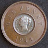
 A Rotographic Imprint. Price guide reference book publishers since 1959. Lots of books on coins, banknotes and medals. Please visit and like Coin Publications on Facebook for offers and updates.

Coin Publications on Facebook

   Rotographic    

The current range of books. Click the image above to see them on Amazon (printed and Kindle format). More info on coinpublications.com

predecimal.comPredecimal.com. One of the most popular websites on British pre-decimal coins, with hundreds of coins for sale, advice for beginners and interesting information.

Recommended Posts

Continuing to go through my coins...

I have an 1896 penny which clearly has much bolder T.B. initials. In particular the full stops are almost as big as the stops between IND & IMP. It's a very noticeable difference and can easily be seen with the naked eye. Has anyone come across this?

Below is a scan showing a typical Obverse 1 with the usual tiny lettering and stops. Underneath is the coin with bolder lettering.

post-5762-006018600 1298590261_thumb.jpg

Share this post


Link to post
Share on other sites

Continuing to go through my coins...

I have an 1896 penny which clearly has much bolder T.B. initials. In particular the full stops are almost as big as the stops between IND & IMP. It's a very noticeable difference and can easily be seen with the naked eye. Has anyone come across this?

Below is a scan showing a typical Obverse 1 with the usual tiny lettering and stops. Underneath is the coin with bolder lettering.

Well now thats strange, i just took a wee looksy at mine and it doesn't have any designer name there at all :unsure:

post-5057-034259500 1298594343_thumb.jpg

Edited by azda

Share this post


Link to post
Share on other sites

it is there but faint, this happens all the way through the series though

Share this post


Link to post
Share on other sites

2 blobs

post-5057-040464900 1298624536_thumb.jpg

Edited by azda

Share this post


Link to post
Share on other sites

Weaker strike I guess.

Share this post


Link to post
Share on other sites

Weaker strike I guess.

I'd go for lower relief which would be easier to block up such that clarity is reduced. Fill a 1mm deep hole to a depth of 0.1mm and you probably won't notice; fill a 0.15mm or 0.1mm deep hole to the same depth and any design will almost or completely disappear.

What Rob said. If you look at the darker coin you will see that the legend is also bolder and stands out more, probably an early strike. I have checked mine and they are both different. One has a worn T and a missing first full stop and the other one is as your bright 96.

Share this post


Link to post
Share on other sites

Looking at your "bolder" example, all the legend shows signs of a double bounce (everything's a bit doubled), which would be enough to blur such tiny letters (and the initials TB are well blurred along with the larger dots). That's what I think may have happened.

Share this post


Link to post
Share on other sites

I've checked my old head Viccies, all of which are UNC, and I can see the initials on all of them, although they are faint, and (if I didn't know) I wouldn't be able to make out what they said without the aid of a magnifying glass.

Share this post


Link to post
Share on other sites

Create an account or sign in to comment

You need to be a member in order to leave a comment

Create an account

Sign up for a new account in our community. It's easy!

Register a new account

Sign in

Already have an account? Sign in here.

Sign In Now

×