
Peckris
-
Posts
9,800 -
Joined
-
Last visited
-
Days Won
53
Content Type
Profiles
Forums
Events
Downloads
Store
Gallery
Articles
Everything posted by Peckris
-
Hobson's Choice Vicky. There isn't any other design by Lavrillier in the UK series. Ugly or not it's a gap to be filled for the attributed designer section of the collection. Strictly speaking it's a pattern, so not a real gap as such. Nonsense. Patterns are every bit as real as currency and have equal status in the collection. They add a nice bit of variety as well, which gets away from the serried ranks of the me too date runs. It isn't an overly long list of designers either. From the 12th century up to the end of £sd I have a list of about 75 people whose names could be attributed to the design. Unfortunately, given the diarrhoeic output of HM's Royal Mint, we now have an almost identical number post 1970 resulting in an enforced 'me too' subset within the list as a result of the Olympic 50ps and others. 50p is in danger of becoming the commonest denomination in the collection, which can't be right and certainly isn't desirable. In the long term though the 50p must inevitably be overtaken by the penny - even the modern ones have a place. Only among those who collect them, which you must admit is only a fraction of collectors of dates and types. For example, I'm only interested in late 18th Century copper patterns, most else leaves me cold - I wouldn't cross the road for a George V double florin or early 60s cent (unless someone gave me them!)
-
1876 penny no H
Peckris replied to headsortails's topic in British Coin Related Discussions & Enquiries
Can you repost it full on rather than at an angle? Thanks. By the way, the bottom of the three above, looks like a wider date than normal, so that might be worth a picture too. Interesting. Two possibilities from what I see there : 1. The H was normal but has worn right away (not an unusual occurrence) 2. The die got clogged up and only partly or faintly struck up the H One thing is certain - it's not an "1876 no H" London Mint variety. The space is there for it. -
Hobson's Choice Vicky. There isn't any other design by Lavrillier in the UK series. Ugly or not it's a gap to be filled for the attributed designer section of the collection. Strictly speaking it's a pattern, so not a real gap as such.
-
1876 penny no H
Peckris replied to headsortails's topic in British Coin Related Discussions & Enquiries
Can you repost it full on rather than at an angle? Thanks. By the way, the bottom of the three above, looks like a wider date than normal, so that might be worth a picture too. -
My friendly note to him: Dear jsp69jsp, I suppose you've noticed that the picture you've supplied is not a 1940 penny, but one of 1900?! Also, the 'penny' has been in circulation since the mid-900's AD, so 1940 isn't exactly old! - cerbera100 His reply... Dear cerbera100, so this isnt a question about the penny at all, just you telling me pointless information thanks - jsp69jsp So apparently informing someone that their title, image and description are utterly wrong is 'pointless information'... Do wonders never cease?! Question is, do I reply, and if so how?! Why am I not surprised. You could turn it into a 'question about the penny' though. How about, "Why is this nice penny owned by an idiot who believes it to be from 1940 when a poorly trained monkey could tell him that it's dated 1900? Moreover, why does the same brainless moron advertise it as the 'oldest on eBay' when the most basic grasp of numeracy would indicate otherwise?" Or something along those lines. Anyway, hopefully he will get his comeuppance when it sells at auction for 99p rather than the £75.54 BIN price! So he has no "sarky get out" I've messaged him asking simply "Is it 1940 as in the description or 1900 as in the photo?" Let's see how he gets out of a straight question. Wonder whether he replied Peckris? Anyway, he's updated the listing and it now reads "the picture says different but the penny is a 1940"! Still the oldest on eBay and "as seen on Antiques Roadshow" though. Twat! Yes he did - simply said it was a 1940 not what it showed in the picture (made some excuse about his camera). So maybe that's what drove him to change the description?
-
Not a fake - a replica, and unsurprisingly poor, at that. Well, the poor replica went for £63. Clever description by the seller, no comment on the bidders. That's appalling. You can pick those up new for £25 or less. (The reason they are poor is probably deliberate - designed that way to prevent fraudulent selling on as either the real thing or a convincing forgery).
-
No, that's the genuine Lavrillier scott. The bad replica is the one in the original post that started this discussion off.
-
Not a fake - a replica, and unsurprisingly poor, at that.
-
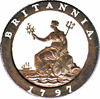
1823 Farthing Georgius IIII
Peckris replied to Forna's topic in British Coin Related Discussions & Enquiries
Her vacant gaze would indicate she's probably watching Eastenders somewhere off-coin! Nah, she doesn't look depressed enough -
1823 Farthing Georgius IIII
Peckris replied to Forna's topic in British Coin Related Discussions & Enquiries
I'd go with EF too. Perhaps a little too much paid but it's very easy on the eye. This coin more than any other shows that Britannia knows how to multi-task! She's probably thinking "Shield, olive branch, trident, lion - no problem. Bring me a fish supper and watch what I can REALLY do" -
Opinions of this Penny
Peckris replied to azda's topic in British Coin Related Discussions & Enquiries
its an 1862 Peck, but its been cleaned Oh right - thanks. I do have a good 1862 already (patinated but better than EF) so I will leave it. Good luck with it -
Opinions of this Penny
Peckris replied to azda's topic in British Coin Related Discussions & Enquiries
You never said what date this penny is Az - I'm looking to upgrade some of my poorer dates, you could be offloading it quicker than you anticipated -
Yup - the "dinghy sailing in a wetsuit" forum is that-a-way ======>
-
I've done a bit more experimenting and the best I can do so far is this. Much nicer! (To my eyes, anyway). Less contrast, good detail, and some iridescence.
-
1823 Farthing Georgius IIII
Peckris replied to Forna's topic in British Coin Related Discussions & Enquiries
I'd rate that a clear EF with traces of lustre. Nice coin, and a fairly 'easy' series to start with. Good work! -
Halfpenny 1853 or 1853/2 ?
Peckris replied to Voynov_BG's topic in British Coin Related Discussions & Enquiries
To my eyes it's EF, though slightly stained in places. -
Opinions of this Penny
Peckris replied to azda's topic in British Coin Related Discussions & Enquiries
The camera never lies, of course... -
Ah, DEGS - the infamous Dismal English Grading Services.
-
Opinions of this Penny
Peckris replied to azda's topic in British Coin Related Discussions & Enquiries
I agree that it is impossible to determine other than by logic. For an example of an earlier thing superimposed on a later character, refer to the 1807/6 proof halfpenny in the confirmed unlisted varieties section. There I was able to show that Taylor took the 1806 broken jewel die and changed the datal 6 to a 7. The 7 can be seen to have sections of the 6 superimposed on top of it where the position of the two digits coincides. This was written up fully in the 2007 BNJ. Another example was in the thread a few months ago that I posted on the spur rowel over saltire mark James I half groat. After discussions and rationalising the arguments for and against, it was reasonably concluded that the majority of the multiple spur rowel cuts were underlying despite being chronologically later than the saltire due to the hardness of the die. Eventually the mark was cut to a depth equal to that of the initial saltire mark. Both could lead you to conclude that the chronology was wrong. Conversely, some marks are cut ever deeper and conventionally in chronological terms. e.g. see the triangle over anchor over tun mark below. Tun was in use 1636-8, anchor 1638-9 and triangle 1639-40. At last my sanity is restored I had always pondered the fact that it was very often discussed depending on the depth of the cut, and this should not be a deciding factor. It could certainly be evidence but should not be definitive evidence. Thansk for the examples I will have a look!! I'm not sure I agree (though far from being expert in such things). I've seen the 1807/6 thread and that's clearly a 7, though there are residual traces of a 6 showing, that's quite certain. From a deeper cut 6, that's also the only reasonable explanation. But it doesn't correspond in any way to those E N diagrams above, as the remains of the 6 do not show beyond the boundaries of the 7. And Dave's penny doesn't show anything like that. It shows a clear E with a lump of something sitting on top of the central portion (it looks almost like a lump of solder). Even if it was the deep lying trace of something original and much deeper, you'd have to account for what it must have been, and the way it sits 'on' the E doesn't seem to bear that theory out anyway. The unerlying E looks kosher, just with a lump of something on it. In the illustrations above, the white letter is clearly the overcut one, but possibly the diagram was constructed in an exaggerated way to illustrate a point? I can't see any Mint official allowing such a lamentably unsuccessful overstrike out, nor any responsible technician keeping their job if that was best job their skill could do. -
Yes I use AF (in macro zoom mode) which the camera seems to handle well enough - but then, I use daylight. Yes, I agree. Flash temperature is pretty constant, whereas AWB or automatic exposure aren't. I've seen AWB variations in two consecutive shots of the same subject in identical lighting conditions. I couldn't disagree more. Your second picture shows massively too much contrast (to my eyes) while the first one I thought "What's wrong with this? Seems good enough to me." It has good exposure, colour and the only thing missing is perhaps a little iridescence, but if shot 2 is the cost of getting iridescence, I'd happily live without it. (I must add - the thumbnails give the reverse impression, and the second shot looks good, but when I enlarge them, that's when I thought again).
-
Opinions of this Penny
Peckris replied to azda's topic in British Coin Related Discussions & Enquiries
Interesting. The super-large picture makes it look like a piece of .. something .. that's got onto the middle of the E and is making it look curved. I can just about see where the underlying E is though. -
Hahahaha, brilliant HARDER MINT, you learn something new everyday. His ME page describes himself "With numismatic passion in our blood" seriously? Maybe you should locate the harder mint then mate I'm looking out for the fabulously rare 1918T, as produced by the Trebor Mint. They weren't as Hard but boy were they STRONG. Sod it. I've only got £600 and not the extra £4 for postage or I might have been tempted. After all, it is the rare "with date" variety. Isn't it the 1877 overstrike variety? You know, the one where both 7s are overstruck with wear?
-
I'll keep that in mind I'm going to follow a lot of your advice but maybe adapt it a little for space reasons. Digital zoom is no good as it looks grainy, I just crop, it's worth the small amount of lost resolution to get rid of that horrible graininess. I use a tripod with the camera pointing down to the coin on a flat surface below. I use daylight (by far the best light). I use maximum MP (for cropping after) I don't use macro close-up as the camera would cast a shadow on the coin, I use 'macro zoom' which means the coin can be a foot away at least. Then I crop, which you can afford to also, as 12MP gives you plenty of scope and you still get a good sized image.
-
My friendly note to him: Dear jsp69jsp, I suppose you've noticed that the picture you've supplied is not a 1940 penny, but one of 1900?! Also, the 'penny' has been in circulation since the mid-900's AD, so 1940 isn't exactly old! - cerbera100 His reply... Dear cerbera100, so this isnt a question about the penny at all, just you telling me pointless information thanks - jsp69jsp So apparently informing someone that their title, image and description are utterly wrong is 'pointless information'... Do wonders never cease?! Question is, do I reply, and if so how?! Why am I not surprised. You could turn it into a 'question about the penny' though. How about, "Why is this nice penny owned by an idiot who believes it to be from 1940 when a poorly trained monkey could tell him that it's dated 1900? Moreover, why does the same brainless moron advertise it as the 'oldest on eBay' when the most basic grasp of numeracy would indicate otherwise?" Or something along those lines. Anyway, hopefully he will get his comeuppance when it sells at auction for 99p rather than the £75.54 BIN price! So he has no "sarky get out" I've messaged him asking simply "Is it 1940 as in the description or 1900 as in the photo?" Let's see how he gets out of a straight question.
-
The problem is that the minority (and that's what they are) of fraudsters, shysters and layabouts are the rope which the Government, The Daily Mail, The News Of The Screws, The Sun, The Star, ITV, and all the rest use to hang the genuinely sick & disabled. I'll put one more fact your way then I'll shut up on the matter (I've become way too sensitive to what's going on) : the fraud rate for DLA is less than 1%, and the total benefit fraud for IB and DLA amounts to £1.5bn. Ok, not a sum to be sniffed at, but when you consider that Count Dracula Osborne is cutting the welfare budget by £18bn, and that tax evaders cheat us all of more than £120bn annually ... well, it makes you think (I hope). Apologies for ranting but life for disabled people in this country just gets worse and worse. I think you can remove the disabled people line from your sentence Peck, the country is rapidly heading down the shitter. Everything is being cut to the bone apart from the prices we pay for essentials like food, fuel and utilities which are all rising faster than a teenage boy at an all girl pool party.