

Rob
-
Posts
12,801 -
Joined
-
Last visited
-
Days Won
347
Content Type
Profiles
Forums
Events
Downloads
Store
Gallery
Articles
Everything posted by Rob
-
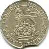
Need grade opinion on this cartwheel 2d.
Rob replied to coinpictures's topic in British Coin Related Discussions & Enquiries
Thanks for the comments. I find it hard to determine what a fair price is for this particular type. Between Krause, Spink, Ebay results, true auction results, and current asking prices with UK dealers, these are all over the map. In solid EF I'm seeing prices anywhere from 125 pounds to 300 pounds. True UNC (by British standards) is 400 pounds and up. The asking price for this particular piece was 225 pounds. I offered 150 pounds and it was accepted. Assuming that there aren't any problems with the coin, even if it's just an EF, I think I did ok. Certified MS examples seem to be off the charts... Krause & Spink are based on historical prices and so do not always reflect reality. Some are overpriced, some under in both cases. Ebay prices are comical and rarely reflect the market value at both extremes. The best bet is somewhere between proper auction prices and dealers' prices. After all, the dealers get a lot of their pieces from auctions too. Certified MS numbers mean in reality that you are buying the quoted grade on the slab rather than the market value of the coin. Frequently you have to go to MS65 to get a truly UNC coin. I'd buy it for £150 as long as the flat breasts and hair haven't been rubbed down and even then it would still be good value. The edges are much better than normally found too. -
Need grade opinion on this cartwheel 2d.
Rob replied to coinpictures's topic in British Coin Related Discussions & Enquiries
I can't see anything wrong with the obverse, so has to be a minimum of EF, probably better. Looking at the breasts and head and if I hadn't seen the obverse I would have said nearly EF, but it is possible that they are a weak strike or infilled which would be unusual. Best thing is to examine both sides and particularly the flat bits under good magnification (x10 minimum) and see if there are any tell tale signs of rubbing. Usually there is some indication of wear to the highest points. If this is the case it isn't UNC as the raised rims on cartwheels are quite effective at keeping the raised parts of the design free from contact with the surface. Other than that it is impossible to tell from the picture as it disintegrates into pixels before you can see any minute detail. Sorry missed a bit. Looks like a dig to the front laurel below the top group -
1996 Great Britain Pound - Possible Mule
Rob replied to a topic in British Coin Related Discussions & Enquiries
Is it a forgery? The detail is awful -
In answer to your two questions I would say pass but probably and no respectively. The legend looks currency and if a proof, the fields are sufficiently marked to say it is slightly impaired. The rim however looks much sharper than average although this may be a result of being slabbed in a piece of moulded plastic. The excess metal to the rim is not a regular feature of Soho proofs, but is of currency pieces or Taylor restrikes and may or may not be filed off in the case of the latter pieces. How many jewels are there in the brooch? Peck states 9 jewels for the currency piece but the picture is not clear enough to say 9 or the 10 that some proofs have. (10 jewels could mean the use of a proof bust punch for a currency die.) I have attached a picture from a Peck 1326 which clearly shows the improved quality of lettering on a proof over that on your piece and I would say yours isn't a proof simply on the quality of strike, sharp rims aside. However, there are penny collectors on this site with a wider range of knowledge of these pieces than me who would perhaps contradict what I have written. Thoughts anyone?

-
Regarding the 1806 1d, it should be straightforward to identify if it is a proof or not by matching the detail to a recognised Peck number. As the only currency pieces listed in Peck are 1342 (with incuse curl) and 1343 (without) it should be a simple matter to check for the half a dozen varieties of proof as these have fairly obvious differences. A restrike proof penny will have a plain edge which can't be checked in a slab, but missing or weak features found on the Soho issued pieces will provide enough evidence. The question of prooflike attributions in slabs is something that muddies the water a bit. I would have thought it not impossible for the various grading companies to incorporate a prooflike strike into their numerical system, after all, if they can knock off a grade for a surface mark, it should be possible to up it a grade for a better than average finish. I suspect therefore that this additional info is a marketing tool to hype up the value. Premium quality (PQ) suffixes are part of the same problem. How to tell a proof from a quality currency piece? Firstly to be absolutely certain you need it in the hand unless it has features only found on proofs which will differentiate it from a currency piece. The piece you bought is not a proof. The 1770 1/2d proof should have a full round border of teeth. The rim/edge will be a right angle as it was struck in a collar although being in a slab you would not be able to see this. The lettering on proofs is almost always perfectly formed with distinct angles where there is a change of profile and is rarely rounded, but against that must be noted that some proofs are identified by their defective lettering. The fields are typically mirrors, but there are examples where storage conditions have degraded the finish so that it is not necessarily obvious. You have to take all the features into consideration. Proof or not has frequently been a bone of contention, even amongst the professionals. A coin in my gallery is a prime example of this. The F329A halfpenny is ex- Freeman and is the coin he based the entry in his book on. Spink contend that this is an early strike and not a proof. This coin was slabbed PF66RD in the Terner sale. So what is it? I'm inclined to lean towards Freeman's assessment, but I can see the other side. A quick glance tells you it is much better than normal. It has full original original colour and if you hold up the coin and use it as a mirror, it is possible to see out into the garden and observe what is going on with virtually full detail but it is still not as perfect as some mirrors I have seen on a proof. For comparison, the currency F329 halfpenny in my gallery has a proof-like reverse which if you hold it up to the light shows the window outline with some shadowy detail for example, but not the garden beyond. It is difficult to compare with words. The rim/edge is a sharper right angle and the lettering is sharper than many acknowledged proofs that I have seen. If you look at the 1 of the date for example it has a flat surface and the sides form angles. There is a close up of this in the anything else posting here where the angular nature of the 1 & 7 characters can be seen. This sharpness of characters is a feature you should be looking for. The obverse is slightly off centre, which counts against it as proofs are supposed to be special strikes and this would be regarded as a minor fault. However, many proofs are not centrally struck. A flat proof rim will often be wider than a currency piece. The general level of crispness of detail is typically better on a proof. I hope this helps a bit. PM me if you have any questions.
-
You've got no chance of getting any folders from the mint. If you put a coin in dire condition inside and try to sell it as the original article, it will be the mint that looks bad, not Mr. Anonymous. Would you risk your reputation doing something like this?
-
Need closeup of 1844 E/N Half Farthing
Rob replied to coinpictures's topic in British Coin Related Discussions & Enquiries
It's not E/N. See attached pic. a bit blurred but the features clear.
-
I've had negs from 3 people. The first was a woman in Southend (ebay id canary123pink) who sold me an 1887 crown in really good condition. Unfortunately when it arrived I discovered it had been silvered and put it to her that it was not at all collectable, potentially could be a dud or just a very nice coin defaced. First reply was that she was a person who had been in the antiques trade for 30 years and would not sell a silvered coin unless described as such, but if I could get a member of the BNTA or a qualified antiques dealer (do they exist?) she would give a refund. Excellent I thought and next day conveyed the news to her that Mark Rasmussen (who had called in that afternoon and who as a former director of Spink and chairman of the BNTA fitted the requirements adequately) was willing to vouch for it being silvered. At this point, all question of a refund was rejected, so negative feedback was the only resort. Thankfully she is now retired from business. Second was from a Mr T Barker (aka. isitmeyourlookingfor (sic)). I had the temerity to leave a neutral on balance for diabolical grading, but a credit for the refund. I purchased a William 3rd 1st bust 'high grade shilling' off him which in the picture posted resembled the second from the left, but no clues as to which is his high grade piece. I pointed out that VF was the lowest you could reasonably accept as high grade and emailed a scan of his and my pieces in VF, gVF or a bit better and EF+ for comparison, pointing out that his was somewhat lacking in quality. For spoiling his 100% positive feedback, he left me a neg. I had to chop off the higher grade pieces to post the image. Third was from Mr P Hentall who sold an 1860 1/2d 1*+A that was about 20% epoxy resin repair kit and another worn unc. Said he knew nothing about coins yet professed to grade them accurately and Phil's coins and curios had over 500 coins and 60 curios. Everything was contradictory. I just hate being taken for a ride. My neg received was a tit for tat.

-
I hope you bought the book. Any correspondence which is attributable to the owner of the book would enhance its resale value, particularly if the book was either Garside's or Batty's. Montagu had little time for later coinage and sold his collection of George 1st onwards to Spink in 1890 in order to concentrate on coins prior to this. The contents of his book as a reference source are not very comprehensive and also included pieces that are today considered to be tokens or similar whereas they were previously considered to be patterns. Some were included on the authority of previous writers without having been examined. Concerning the varieties of penny, it is fair to say that the major collectors of the era on the whole paid relatively little attention to contemporary common currency pieces. A situation which hasn't changed much today.
-
Potentially this is a good starting point for a thread on negative feedback experiences. Would that be acceptable given that you would likely only hear one side of the story - Chris?
-
Don't worry about it Chris. It's easy to get negative feedback. All you have to do is give a straightforward, honest and accurate explanation of what is wrong and many egos get bruised. God, I wish I was infallible like them.
-
Charles I Tower shilling varieties
Rob replied to TomGoodheart's topic in British Coin Related Discussions & Enquiries
I presume you know about this one. CAROLS E2/2 i.m. Tun. Mine is ex- Roger Shuttlewood who had found a better one, so there are at least 2 about. -
I've only got pointed 7 to tooth and slightly left of tooth

-
There are 4 sub-varieties of 1957 calm sea 1/2ds as follows. Pointed 7 to bead - scarce Pointed 7 slightly left of bead -very rare Pointed 7 over space - rare Blunt 7 to bead - very scarce There was a thread on this on Colin Cooke's website a while back.
-
1942 GEORGIVS TWO SHILLINGS COIN
Rob replied to a topic in British Coin Related Discussions & Enquiries
None of the currency George VI florins are rare. 1938 is a bit scarcer than the rest, but the only rare pieces are proofs and trial strikings, none of which would normally be encountered. -
And this wasn't this colour when it sold at Baldwin's in May. This piece was coloured the same as Nicholson 157 when seen in the hand, with the same dull finish as becomes a halfpenny in VF or thereabouts.
-
Charles I Tower shilling varieties
Rob replied to TomGoodheart's topic in British Coin Related Discussions & Enquiries
I'm a bit short on unrecorded Chas 1s but this isn't in Brooker or anywhere else to my knowledge. H instead of HI or HIB
-
First of all the grading services seem to grade according to market whims. They do slab dipped coins which then become "frosty white". Also artificially toned coins get higher grades because they have "better colour" and this is the latest fashion statement in US numismatics - or so it seems. I'll go along with the idea of people not recognising the perfect coin. e.g.The number of slabbed MS63 James II shillings is considerable and covers grades from gVF upwards. I have only ever seen ONE mint state example with full laurel detail, a fully struck up reverse, full lustre and no weakness anywhere. Sadly it wasn't mine and it wasn't for sale. Looking through auction catalogues is probably the easiest way to learn what a mint state example looks like. Dealers' lists are not, they are trying to sell for maximum profit. eBay has two grades. UNC covers VF-UNC (usually) and high grade or extremely fine the lower grades, so can be dismissed.
-
When I started collecting back in about 1970 I brought a book called "Picture guide to coin condition" by Burton Hobson. Although a bit limited it goes through various coins showing were they wear and the amount of wear in each grade. I don't know if it's still available. Updating it could be an ideal project for Chris At the beginning of the milled section in Spink (p.304 in the 2006 issue) there are pictures of coins in various grades together with a written description of what each grade has in terms of wear or features visible. Given the number of people that quote Spink prices and so must own this volume, it is somewhat surprising that they don't appear to have noticed these pages, or perhaps it's simply that they don't support the wished for and claimed grade.
-
None. The last currency issue tin farthings were dated 1692 before being superseded by the copper issue of 1694, although patterns were regularly produced in tin up to the 1800's.
-
Certainly a modified effigy, there's very little detail left
-
It appears to be a modern concoction based on the touchpieces issued during the reign of Charles II for the touching ceremony for sufferers of the "King's Evil" or scrofula. It combines the basic features of St. Michael piercing the dragon found on the reverse of Peck 496 (with rearranged legend, missing the star at the base and also of smaller diameter) together with the reverse of Peck 494 (again with rearranged legend and space left for the hallmarks). These were produced in various base metals and combinations of the same. Historically they used hammered gold coins of various denominations, which is why you get so many pierced angels, nobles etc. but these were later replaced by the use of tokens. A few examples of these are pictured in the first section of the Nicholson collection if you want to see what they look like.
-
High Tide - It's round her waist!
-
Another quality example of grading. 1843 penny It would somewhat more useful to quote firstly the correct value in Spink which is £1100 for the no colon variety instead of the with colon price and secondly the VF price of the coin £250 in Spink (or £125 if you can't identify it properly) given that the obverse struggles to this grade so the better reverse cannot compensate to any large extent - or might that bring on a dose of reality?
-
What a pity the referees and players didn't perform like that 60 games ago


