
Emperor Oli
-
Posts
2,357 -
Joined
-
Last visited
Content Type
Profiles
Forums
Events
Downloads
Store
Gallery
Articles
Everything posted by Emperor Oli
-
The Darkness
Emperor Oli replied to Chris Perkins's topic in Nothing whatsoever to do with coins area!
...or dentistry's equivalent of total refurbishment -
The Darkness
Emperor Oli replied to Chris Perkins's topic in Nothing whatsoever to do with coins area!
They're not big, they're wiggled and overlapping. In "I believe in a thing called love", he runs through a tunnel and a camera does a closeup of them. I tried to find a picture on the internet but to no avail -
Early Milled Coinage
Emperor Oli replied to Sylvester's topic in British Coin Related Discussions & Enquiries
Christians would probably say Godless Florins are -
Victorian Half Crown and others
Emperor Oli replied to a topic in British Coin Related Discussions & Enquiries
Could you post some on the boards? I know i'd like a look at them! -
The Darkness
Emperor Oli replied to Chris Perkins's topic in Nothing whatsoever to do with coins area!
Hawkins' teeth scare me -
2004 Issues
Emperor Oli replied to Emperor Oli's topic in British Coin Related Discussions & Enquiries
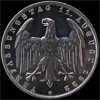
Here's a photo of the "coins"
-
Good idea!
-
Here they are and the new deluxe set is in a wooden box; classy!

-
How do I upload an image?
-
As you may see in my earlier post, I have a mild distaste for the new issues; What do you think?
-
I've just got the leaflet through for the new 2004 issues from the Royal Mint. I am horrified. I had a bloody seizure. Has the Mint gone stark-raving mad? The new £2 is abysmal - I cannot stress enough how rubbish it looks. With a steam engine poking around and weird 'power-words' like "invention", "industry" and "progress", you would wish you were blind. Moving on, the £1 is quite bearable. However, looking at the further "Bridge" £1s to be released, I can't help be shocked at the designs on them. The new 50p with Roger Bannister's legs on and a stopclock is extremely boring and not-at-all exciting to the eye. Where has the sculptor's skill gone? Do other people agree with me that these new issues are ludicrous? I have set up a Vote to se how others feel....
-
I was pondering where everyone get's their coins from; I buy most of mine over the internet but when I've bought gold coins (rarely!) I go to jewellers to see what they've got, as you can actually see the coin in real life before parting with your money.
-
I was just wondering what the best (i.e Most valuable) coin is that people in this forum owned. Mine would be an 1833 Sovereign in VF - £325 (according to Spink 2004)
-
Charles III?
Emperor Oli replied to Chris Perkins's topic in British Coin Related Discussions & Enquiries
They will have to resize the coins or his head to fit his nose on -
I'd personally believe Spinks, after all, they've been established since 1666 and so have a considerable knowledge! The Richard's reference does seem preposterously low however that's just my opinion
-
Whoa! I nearly had a seizure when I saw that wooden "cabinet". How one can compare that to Nichol's is beyond me....
-
Unless they are extremely old or rare, I don't think "crusties" are any good but that's my opinion...
-
Charles III?
Emperor Oli replied to Chris Perkins's topic in British Coin Related Discussions & Enquiries
Charles should be King, as there is no reason for him not to be, but he should drop the horse (*cough* camilla *cough* *cough*) -
I know these are different "forgeries" but in the Daily Mail a while ago, they had a bit on these coins from an African country. They were made out of the same alloy as pound coins, had their country's monarch on the obverse, felt like pound coins and looked, at-a-glance, like real pound coins. The problem must have been ironed out as I didn't see any follow-up on it...
-
Slightly off-topic but David Dickinson was convicted of fraud so one really shouldn't believe what he says!
-
Well, a few days ago, I bought three Farthings off Ebay from a guy called "Sharpclaw". The pictures were fantastic, absolutely no blemishes or anything - "This is too good to be true!" I thought. Sadly, it was; the coins arrived and although they did have some lustre on all of them, it was nothing compared to the photos purporting to be the coins for sale . I was miffed because I'm trying to assemble a collection of Farthings between 1902 and 1956 in the best Uncirculated condition.
-
Hmm Brazilian stock mahogany or plastic? I know which one I'd choose
-
Hi I'm called Oliver and I'm only 14 but i've been collecting for about three years. It started when I was rooting through my grandparents attic and I found my grandfather's old coins. I bought Spinks catalogue and looked them up to find out a bit more information on them. The best I found was a William & Mary 1692 QVARTO Crown in VF that's worth £900 in Spink 2004 ! I didn't really store my coins very well so last year I bought a cabinet from Peter Nichols (www.coincabinets.com), the BEST coin cabinet maker ever, who also makes cabinets for the British Museum. It now takes pride of place on my desk. I collect from George II to the present day and enjoy collecting a lot. oliver
-
On the earlier colour "debate", I personally hate coloured coins. A bit of colour is ok, like the little flags coloured on the 2002 Commonwealth Games set, but colour all over is just grotesque. I think it detracts from the art of real sculptors who have an extremely good skill and impresses people with the colour alone.

