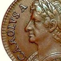
Michael-Roo Posted September 7, 2014 Posted September 7, 2014 I have a really nice, clear, example of this variety.Commonly referred to as 'G over O'. I've read in the past there has been some dispute as to what the G is actually punched on top of. No doubt it is over something. Do other members have any views they would like to share?The coin is listed in the Cooke collection as 'extremely rare'. I'd also be interested to hear your estimates of how rare it is (numbers known etc).Thanks all Quote
Peckris Posted September 7, 2014 Posted September 7, 2014 Behind the top right of the G it looks like the top of something like a U - a horizontal serif and a downstroke; this would make the curve of what is thought to be the O somewhat of a problem. Perhaps it's no more than a blob of metal unless it occurs on more than one example? However, there's definitely MORE than an O behind that G. Quote
Michael-Roo Posted September 7, 2014 Author Posted September 7, 2014 Behind the top right of the G it looks like the top of something like a U - a horizontal serif and a downstroke; this would make the curve of what is thought to be the O somewhat of a problem. Perhaps it's no more than a blob of metal unless it occurs on more than one example? However, there's definitely MORE than an O behind that G.Hi Chris.There are plenty of examples of this one in the archives, so not simply a 'clutter' anomaly. London Coins sold a ropey fine one some years ago. C Cooke had one. Our fellow member who has the farthing site lists it. So very much a recognised variety. It's true it may not be that the G is over an O (but it certainly looks like it is), however it certainly is over another letter. I must admit, I hadn't spotted evidence of a serif. I'll have a look and report back. Quote
Michael-Roo Posted September 7, 2014 Author Posted September 7, 2014 Behind the top right of the G it looks like the top of something like a U - a horizontal serif and a downstroke; this would make the curve of what is thought to be the O somewhat of a problem. Perhaps it's no more than a blob of metal unless it occurs on more than one example? However, there's definitely MORE than an O behind that G.Hi Chris.There are plenty of examples of this one in the archives, so not simply a 'clutter' anomaly. London Coins sold a ropey fine one some years ago. C Cooke had one. Our fellow member who has the farthing site lists it. So very much a recognised variety. It's true it may not be that the G is over an O (but it certainly looks like it is), however it certainly is over another letter. I must admit, I hadn't spotted evidence of a serif. I'll have a look and report back.That'd be Colin. Apologies. I wasn't being rude. Just didn't have the info to hand as I was writing…. Quote
Peckris Posted September 7, 2014 Posted September 7, 2014 Behind the top right of the G it looks like the top of something like a U - a horizontal serif and a downstroke; this would make the curve of what is thought to be the O somewhat of a problem. Perhaps it's no more than a blob of metal unless it occurs on more than one example? However, there's definitely MORE than an O behind that G.Hi Chris.There are plenty of examples of this one in the archives, so not simply a 'clutter' anomaly. London Coins sold a ropey fine one some years ago. C Cooke had one. Our fellow member who has the farthing site lists it. So very much a recognised variety. It's true it may not be that the G is over an O (but it certainly looks like it is), however it certainly is over another letter. I must admit, I hadn't spotted evidence of a serif. I'll have a look and report back.On your photograph, the top right of the G curves down, like a C - however, there's another feature behind it that continues straight on; that to my eyes looks like a serif. Then if you go down from the top right, to the horizontal cross-stroke of the G, between the two there is a down stroke that exactly matches the vertical on the left, that probably has been thought of as the left inner of an O (but it may not be?). Quote
Michael-Roo Posted September 8, 2014 Author Posted September 8, 2014 Behind the top right of the G it looks like the top of something like a U - a horizontal serif and a downstroke; this would make the curve of what is thought to be the O somewhat of a problem. Perhaps it's no more than a blob of metal unless it occurs on more than one example? However, there's definitely MORE than an O behind that G.Hi Chris.There are plenty of examples of this one in the archives, so not simply a 'clutter' anomaly. London Coins sold a ropey fine one some years ago. C Cooke had one. Our fellow member who has the farthing site lists it. So very much a recognised variety. It's true it may not be that the G is over an O (but it certainly looks like it is), however it certainly is over another letter. I must admit, I hadn't spotted evidence of a serif. I'll have a look and report back.On your photograph, the top right of the G curves down, like a C - however, there's another feature behind it that continues straight on; that to my eyes looks like a serif. Then if you go down from the top right, to the horizontal cross-stroke of the G, between the two there is a down stroke that exactly matches the vertical on the left, that probably has been thought of as the left inner of an O (but it may not be?).I've had a another look using my loupe. The 'blob' at the end of the G (upper right) is just the serif at the end of the letter, not something lying beneath. The downstroke of the underlying letter curves out and in again as would an O. If it were the right vertical stroke of a U it would be more upright. We may have to wait for Colin's input on this one…. Quote
Peckris Posted September 8, 2014 Posted September 8, 2014 Behind the top right of the G it looks like the top of something like a U - a horizontal serif and a downstroke; this would make the curve of what is thought to be the O somewhat of a problem. Perhaps it's no more than a blob of metal unless it occurs on more than one example? However, there's definitely MORE than an O behind that G.Hi Chris.There are plenty of examples of this one in the archives, so not simply a 'clutter' anomaly. London Coins sold a ropey fine one some years ago. C Cooke had one. Our fellow member who has the farthing site lists it. So very much a recognised variety. It's true it may not be that the G is over an O (but it certainly looks like it is), however it certainly is over another letter. I must admit, I hadn't spotted evidence of a serif. I'll have a look and report back.On your photograph, the top right of the G curves down, like a C - however, there's another feature behind it that continues straight on; that to my eyes looks like a serif. Then if you go down from the top right, to the horizontal cross-stroke of the G, between the two there is a down stroke that exactly matches the vertical on the left, that probably has been thought of as the left inner of an O (but it may not be?).I've had a another look using my loupe. The 'blob' at the end of the G (upper right) is just the serif at the end of the letter, not something lying beneath. The downstroke of the underlying letter curves out and in again as would an O. If it were the right vertical stroke of a U it would be more upright. We may have to wait for Colin's input on this one….No, I don't mean the blob of metal that makes people think of an O - I mean underlying that, and fractionally to the left : there's a vertical, straight, downstroke exactly matching the vertical downstroke inside the left hand curve of the G. Quote
Michael-Roo Posted September 8, 2014 Author Posted September 8, 2014 Behind the top right of the G it looks like the top of something like a U - a horizontal serif and a downstroke; this would make the curve of what is thought to be the O somewhat of a problem. Perhaps it's no more than a blob of metal unless it occurs on more than one example? However, there's definitely MORE than an O behind that G.Hi Chris.There are plenty of examples of this one in the archives, so not simply a 'clutter' anomaly. London Coins sold a ropey fine one some years ago. C Cooke had one. Our fellow member who has the farthing site lists it. So very much a recognised variety. It's true it may not be that the G is over an O (but it certainly looks like it is), however it certainly is over another letter. I must admit, I hadn't spotted evidence of a serif. I'll have a look and report back.On your photograph, the top right of the G curves down, like a C - however, there's another feature behind it that continues straight on; that to my eyes looks like a serif. Then if you go down from the top right, to the horizontal cross-stroke of the G, between the two there is a down stroke that exactly matches the vertical on the left, that probably has been thought of as the left inner of an O (but it may not be?).I've had a another look using my loupe. The 'blob' at the end of the G (upper right) is just the serif at the end of the letter, not something lying beneath. The downstroke of the underlying letter curves out and in again as would an O. If it were the right vertical stroke of a U it would be more upright. We may have to wait for Colin's input on this one….No, I don't mean the blob of metal that makes people think of an O - I mean underlying that, and fractionally to the left : there's a vertical, straight, downstroke exactly matching the vertical downstroke inside the left hand curve of the G. Ah yes. I see what you mean. Quote
Colin G. Posted September 10, 2014 Posted September 10, 2014 I have not yet examined a clear enough example to be confident regarding the underlying letter. I can see what Peck is mentioning, but other images I have do not show this feature so it may just be this image. I can see why gets referred to as G/O, although it could just be a con-incidental flaw caused by a flake of metal breaking away from the die. Colin Cooke was convinced enough to refer to it as a G/O, so I will continue to classify it as such until I get to handle an example that allows me to study in more detail. Quote
Michael-Roo Posted September 10, 2014 Author Posted September 10, 2014 I have not yet examined a clear enough example to be confident regarding the underlying letter. I can see what Peck is mentioning, but other images I have do not show this feature so it may just be this image. I can see why gets referred to as G/O, although it could just be a con-incidental flaw caused by a flake of metal breaking away from the die. Colin Cooke was convinced enough to refer to it as a G/O, so I will continue to classify it as such until I get to handle an example that allows me to study in more detail.Cheers Colin. Mine is EF (though you might not know so from the photo), and the partially visible underlying form is clear and certainly a letter. Well cut and in high relief. Definitely not die crud. And, you're right, Colin Cooke always did catalogue it as such, so I guess we'll go with that for the foreseeable. Quote
Recommended Posts
Join the conversation
You can post now and register later. If you have an account, sign in now to post with your account.