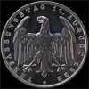
Emperor Oli Posted October 15, 2006 Posted October 15, 2006 Just reading a thread on CU about images people "nailed", i.e. they were as close to the true look of a coin as possible. The first image of this coin I thought was quite something! The toning isn't particularly to my taste in the second view of it, but the cameo effect is amazing. Quote
Hussulo Posted October 15, 2006 Posted October 15, 2006 (edited) Wow that is some coin! I prefare the first view as well. Edited October 15, 2006 by Hussulo Quote
ken46 Posted October 15, 2006 Posted October 15, 2006 Just reading a thread on CU about images people "nailed", i.e. they were as close to the true look of a coin as possible. The first image of this coin I thought was quite something! The toning isn't particularly to my taste in the second view of it, but the cameo effect is amazing.Both are beautiful but likewise I like the first better. I did not try to look up but I assume the engraverwas Pingo? Actually I don't even know what denomination this is. Quote
Sylvester Posted October 16, 2006 Posted October 16, 2006 Looks like a penny?Kuchler was the designer of this series. Definately much better workmanship than Lewis Pingo ever had to offer. Not that i don't like Lewis Pingo you understand! Thomas Pingo was much better. Quote
Recommended Posts
Join the conversation
You can post now and register later. If you have an account, sign in now to post with your account.