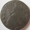
scott Posted June 10, 2013 Posted June 10, 2013 clearest picture of the 2 enlarged i could get.ran this by some americans (they have loads of random pointless overstrikes on everything so if anyone can see one they can) and said it was.now such a variaty i havn't found listed or sold, hard to spot with the naked eye due to size of the coin, however the date is a fit for other overdates in other series so why not. Quote
Peckris Posted June 10, 2013 Posted June 10, 2013 (edited) clearest picture of the 2 enlarged i could get.ran this by some americans (they have loads of random pointless overstrikes on everything so if anyone can see one they can) and said it was.now such a variaty i havn't found listed or sold, hard to spot with the naked eye due to size of the coin, however the date is a fit for other overdates in other series so why not.Too much 'gunk' there to see anything clearly scott The off-putting bit is that horizontal 'spur' to the left halfway down the diagonal downstroke of the 2 - it doesn't correspond to anything you'd see on a '1'Also, the bottom of the '1' would be horizontal not vertical, surely? Edited June 10, 2013 by Peckris Quote
scott Posted June 10, 2013 Author Posted June 10, 2013 (edited) most over 1's are exactly that, a line, which is why i thought of it being so. Edited June 10, 2013 by scott Quote
Peckris Posted June 10, 2013 Posted June 10, 2013 most over 1's are exactly that, a line, which is why i thought of it being so.It's just that I'm looking at the first '1' in the date, which clearly has a serif at the bottom, which would make overdating with a '2' particularly simple at that point. There would be no need for an extra portion of downstroke, wouldn't you say? Quote
scott Posted June 10, 2013 Author Posted June 10, 2013 yea, thats the thing, I have 1861 halfpennies 1 over lower 1, and the lower in is exactly that, no serif. you can barely see it with the eye so they wouldn't have been that far off. Quote
Peckris Posted June 11, 2013 Posted June 11, 2013 yea, thats the thing, I have 1861 halfpennies 1 over lower 1, and the lower in is exactly that, no serif. you can barely see it with the eye so they wouldn't have been that far off.Ah, but that's where they were trying to eradicate a LOWER '1' - having an extra serif there would be mighty inconvenient. But a normal '2' over a normal '1' - they would both bottom out with a horizontal, right? So basically the 2 would cover up the 1 at that point. Quote
scott Posted June 11, 2013 Author Posted June 11, 2013 as i said it isn't visible with the eye, I never noticed it until I looked at the pictures. so it isn't that difficult to get it off at most 1mm Quote
Recommended Posts
Join the conversation
You can post now and register later. If you have an account, sign in now to post with your account.